


Double page spread design created


Front cover designs produced


Screenshots of work production


This screenshot shows one of my front cover designs created using Adobe Photoshop.

This is another design that I have created using Adobe Photoshop for my front cover, but this time using a different background to the image.

This is my first design created for my front cover.

This shows me creating my front cover using the software Adobe Photoshop


This screenshot shows me dragging one of my images to the background of my front cover.

This is one of the many designs which I have created for my front cover. I used a variety of backgrounds to see which cover attracted its audience more and stood out.

I have cut around this image of the umbrella and placed it onto a gradiented background.


I have arranged my article into 3 columns and made it so that it fits around the picture box for the main image.

I have changed the colour of my headline for the article so that it stands out against the background.

Here I have imported the image that I was planning to use to see how it would look on the page. I have also added a byline which is situated underneath the headline in the top right hand corner.


I have added a black background to the page and changed the colour of the article text from black to white, so that the page looks more appealing to its audience through using a different coloured background rather than plain white.

 The picture shows me arranging the text of my article so that it fits in with the layout on the page. I have also changed the background to the image by creating a gradient effect using photoshop, so that the image looked more appealing to the audience and blended in more with the colours used on the page.


I have changed the arrangement of the text into a different number of columns so that it fits around the image.

This screenshot shows me erasing the background of one of my images, which I then cut around the gems on the image and added them to the background layer undreneath, which was used as the background of my double page spread.

This image shows me arranging text boxes on the page, so that my aritcle can fit in around the image below.

This screenshot is from when I first began creating my contents page. I started by adding in the title of my magazines and also the word contents. I also added a smaller image of my front cover as this is what I have seen used in other magazines.

This screenshot is taken after I have imported all of the text onto my contents page, and also after the first image has been imported.

This screenshot shows me creating a new picture box so that I can add another image to the page.

Here I am resizing images so that they fit in with the layout of the page, and also arranging text around the images.

This screenshot has been taken throughout the production were I am importing new images to the page, and arranging the text and images so that they all fit in with the layout.

This screenshot shows me rearranging the text and images on the page so that they all fit on, but rearranging text and picture boxes so that a creative layout is still used.

 Here I have changed the smaller image of my front cover to the new design that I had created. I have also added in headings says 'regulars' and 'features', to split up the text on the page and make it easier for the reader to read. I have also changed the font of the word contents so that it is not the same as that of the title. This screenshot shows me creating text boxes which will be used to add page numbers to the images.
 This screenshot shows me rearranging text and images so that they fit onto the page, and also use a creative layout which will attract the audience.

This is one of the designs which I have created for my contents page, using a different layout so that text and images fitted onto the page but did not seem too packed.


Screenshots of work production


This screenshot shows one of my front cover designs created using Adobe Photoshop.

This is another design that I have created using Adobe Photoshop for my front cover, but this time using a different background to the image.

This is my first design created for my front cover.

This screenshot shows me transferring one of the images to the background of my front cover.

This shows me creating my front cover using the software Adobe Photoshop

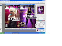
This screenshot shows the two designs which I have created for my front cover. I have used a different image on both of the covers, and arranged the text so that they frame around the image. I dragged the layers from one of the covers and added them to the other, so that all layers where the same.

I have zoomed in on the front cover so that I could carefully arrange the strapline around the image.

This screenshot shows me dragging one of my images to the background of my front cover.

This is one of the many designs which I have created for my front cover. I used a variety of backgrounds to see which cover attracted its audience more and stood out.

I have cut around this image of the umbrella and placed it onto a gradiented background.

This screenshot is taken from when I first began creating my double page spread. Here I am arranging the article around the page, and adding picture and text boxes to make sure that the design fits in with the layout of the page.

I have arranged my article into 3 columns and made it so that it fits around the picture box for the main image.

I have changed the colour of my headline for the article so that it stands out against the background.

Here I have imported the image that I was planning to use to see how it would look on the page. I have also added a byline which is situated underneath the headline in the top right hand corner.

This screenshot shows me searching for a new file so that I can import an image onto my double page spread.

I have added a black background to the page and changed the colour of the article text from black to white, so that the page looks more appealing to its audience through using a different coloured background rather than plain white.

I have changed the colour of the headline so that I had a variety of double page spread drafts using different colours, so that I could choose which page appealed to the audience more through the use of colours.
 The picture shows me arranging the text of my article so that it fits in with the layout on the page. I have also changed the background to the image by creating a gradient effect using photoshop, so that the image looked more appealing to the audience and blended in more with the colours used on the page.
I decided to change the layout of my double page spread as the original layout seemed too compressed. I retook another image and edited this so that I had a plain background which matched that used on the double page spread. I also added quote boxes to my article which I have seen used in other magazines, and added a background to the text box of my standfirst so that it stood out. I have also rearranged the text so that it again fits around the image used.

This is a screenshot showing me working on my double page spread, and arranging the image so that it fits around the text. It shows how I have changed the layout of the page.

I have added text into the quote boxes on the page, and also changed the colour of the headline.

I have changed the colour of the headline to blue so it relates to the image by representing rain.

This screenshot shows me opening up the colour samples to edit the colour of my headline.

This screenshot shows how I have changed the image on my double page spread, adding the effect of 'bling' on the umbrella.
I have also changed the colour of my headline to match the image.

I have changed the arrangement of the text into a different number of columns so that it fits around the image.

This screenshot shows me erasing the background of one of my images, which I then cut around the gems on the image and added them to the background layer undreneath, which was used as the background of my double page spread.

This image shows me arranging text boxes on the page, so that my aritcle can fit in around the image below.

This screenshot is from when I first began creating my contents page. I started by adding in the title of my magazines and also the word contents. I also added a smaller image of my front cover as this is what I have seen used in other magazines.

This screenshot is taken after I have imported all of the text onto my contents page, and also after the first image has been imported.

This screenshot shows me creating a new picture box so that I can add another image to the page.

Here I am resizing images so that they fit in with the layout of the page, and also arranging text around the images.

This screenshot has been taken throughout the production were I am importing new images to the page, and arranging the text and images so that they all fit in with the layout.

This screenshot shows me rearranging the text and images on the page so that they all fit on, but rearranging text and picture boxes so that a creative layout is still used.

This is one of the designs that I have created for my contents page, were I have rearranged text and images to make it all fit inside the outline of the blue lines, but make it so that it does not seem too packed for the audience to read.
 Here I have changed the smaller image of my front cover to the new design that I had created. I have also added in headings says 'regulars' and 'features', to split up the text on the page and make it easier for the reader to read. I have also changed the font of the word contents so that it is not the same as that of the title. This screenshot shows me creating text boxes which will be used to add page numbers to the images.
 This screenshot shows me rearranging text and images so that they fit onto the page, and also use a creative layout which will attract the audience.
This is one of the designs which I have created for my contents page, using a different layout so that text and images fitted onto the page but did not seem too packed.
No comments:
Post a Comment